From my corner of the world in California I think the media presents a hostile view of life; that shootings are happening more frequently than ever, that we’re being manipulated by politicians and corporations, and that an excess diet of eggs is going to give us cancer. Or, wait… I guess they’re good for you now. It sounds like other countries are taking note as well. So…
Is there anything about death in recent years that we should actually be worried about?
I don’t think death is nearly as common or likely as they believe so I’m going to be look at death statistics in this post to give a general idea of the state of things in the past 17 years. By using data gathered from the CDC on California deaths I intend to give a clear view on death, it’s most commonly talked about causes, and it’s general probability against the surviving population. From what I’ve read in the past I believe the most likely causes of death are heart related illness and motor-vehicle collisions, and I’ll compare that with what I believe most people would worry about; homicide and terrorism. (Well, I would do terrorism, but there’s actually no listed deaths for terrorism in California, so that makes a great start!)
I intend to show whether or not either view is correct.
Overview
So to start off with I want to show an overview of the general population and their deaths, then show what people would most fear dying by; traumatic deaths.
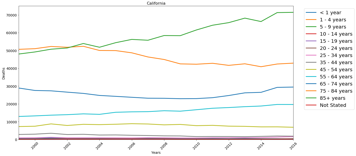
So with this we can see that across all of California the age groups dying the most tend to be in the upper age ranges, and as people get older they die more often. Pretty much what one would expect. The increase looks to be relatively exponential as well. 35 to 44 is barely off the ground compared to everything below it, while 45 to 54 is about double. As I’ll show in a later chart, the reason for this appears to largely be due to medical issues rather than traumatic injury, which is again what one might expect.
Deaths by County
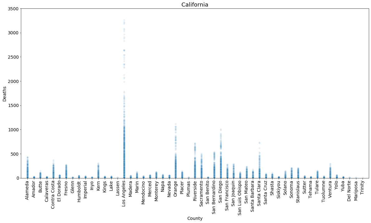
While not a surprise, this does show how a population influences the appearance of the data. LA is a pretty big place, but this graph would have you believe people are dropping like flies in comparison to literally any other county! What you don’t see though is that LA has a population in the millions, while a place like Trinity come in at just over ten thousand. Have you ever even heard of Trinity county before? Cause that was a new one to me!
Top Five for Age Groups
| Overview of Infants >1 y/o in San Diego | Of those, the top 5 causes of Death in 2016 |
|---|---|
 |
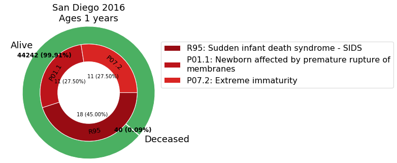 |
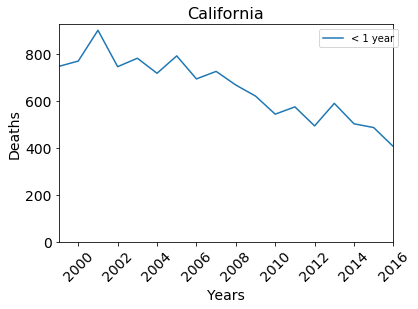
A pretty good sign. In the most recent year for the dataset we aren’t even up to 5 causes of death! And of those, there’s only 40 that died, all of which were medical issues with two of them happening prior to birth. If we look at the graph we can also see that it’s trending down over time.
I know dead babies isn’t exactly a heartwarming story to talk about but just going by the data that’s a pretty stellar ratio and it’s getting better every year.
| Overview of people 85+ y/o in San Diego | Of those, the top 5 causes of Death in 2016 |
|---|---|
 |
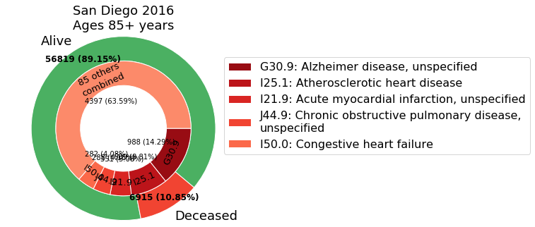 |
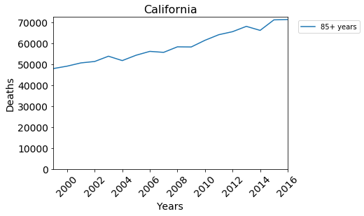
In this case we can see not only is there a top five, but that there’s a whole 85 other causes of death not included in the list. If I put them all there, this chart would quickly become impossible to read, but on top of that we can see that there’s a trend going upwards for people in this age group.
Since this age group is partly unbounded, my guess is that as our medical technology and knowledge gets better we’ll simply see a larger part of the population surviving in this range. With a higher population you’ll generally see an increase in deaths regardless, even if the technology is better, take that seaborn graph for example. But you want to see some of the common types of death, right? Let’s get to it then.
Common Causes of Death
Cancer
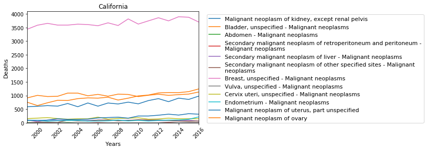
BY FAR the biggest cause of death with cancer is lung cancer. Breast cancer is a far second at maybe a fourth that of lung cancer. I reduced the types of cancer here because listing all of them balloons the graph’s legend out and it wont really say any more than this does, not unless you want a deeper look that is.
Heart Failure
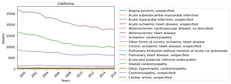
Now this is a comforting one to see. Well, the trend is anyway. At about 18,000 deaths in 2016 that’s still far and away the highest cause of death of any I’ve looked at here, even if it’s trending downward. However, it is going down, which is fantastic to see. On a country scale heart disease in general accounts for about 600,000 people, and even on a state scale it’s pretty clear that if you’ve got some fear of death, it should be directed this way.
I don’t like exercise any more than most Americans, but clearly we need it. Modern medicine can only go so far before we need to start replacing hearts and veins to keep us going, and what’s it matter then if we can’t move on our own anymore? I’ve met people like that in the past, and while it didn’t exactly scare me straight, I’m certainly up for a bit of exercise every now and then to keep that from being me.
Car crashes
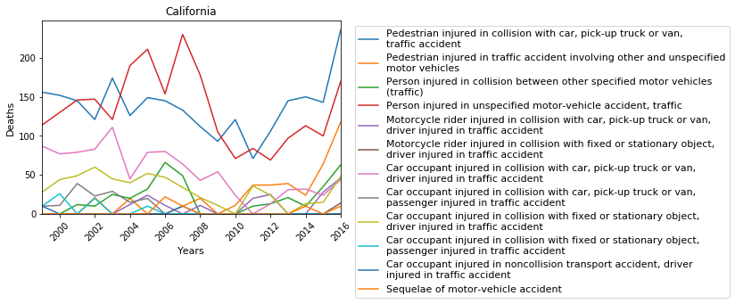
This one was actually much lower than I thought it’d be, but maybe that’s just the news on the I-5 that’s got me thinking that way. That and car crashes are generally pretty scary to be around when it happens, but here we can see that pedestrians getting hit are the highest, with the second highest being a miscellaneous line for unspecified pedestrian collisions. Additionally it looks like the driver tends to get killed more often than passengers, though I think I’d chalk that up to people not really car-pooling too often from what I’ve seen.
Fortunately for motorcyclists they have a pretty low rate here, so good on you guys!
Homicide
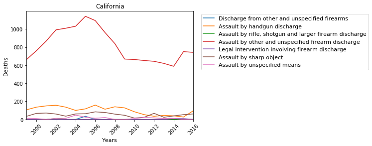
And here we see the problem with miscellaneous categories. It looks like there could be a wide variety of things that are all getting thrown into the same thing for ease of paperwork. I’m really not sure how to take this one, but at the very least I can say this one doesn’t hold suicides in that category.
Suicide
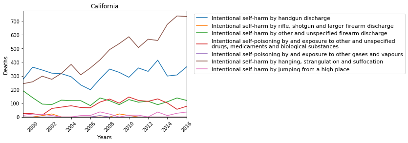
Lastly we see that people’s favorite flavor of death is strangulation, though maybe that’s related in some way to autoerotic asphyxiation? Either way, it’s followed soon after by handguns. I’m actually not sure why someone would choose strangulation personally, I mean, you have to sit around and wait for it to happen at that point, right? I mean I guess shooting yourself isn’t much better; you’d leave a mess for your family to clean up.
In Conclusion
The reason I’m bringing these up like this isn’t really to show off all the ways people can die or to be edgy, it’s to show how unlikely it is. Even at the upper ranges of 10% with the elderly, there’s a significant part of the population that actually stands an overwhelming chance of surviving each year. The highest rate of deaths from what we’ve viewed here come from heart disease, and that’s very preventable. I’m certainly not in any position to be critiquing people’s lifestyles, and for the most part I don’t, but I think if people were really afraid of dying they’d be more fearful of the ways that claim most people. Even saying that though, I know in my case I’m the same way; staring down the barrel of a gun with your family behind you is a much more real threat than a hundred-thousand burgers hardening your arteries. What I’m getting at here is there’s a chance for people to die, but there’s a greater chance for people to live. So in the end, remember,
